Wednesday, 13 June 2012
End Of Project
It has come to the end of my project and I have completed my final pieces. I think the overall result was a success although I did encounter problems during the process which I have recorded in my sketch book and final evaluation.
Monday, 28 May 2012
Barcelona: Museu Tèxtil i d’Indumentària
The last museum I visited in Barcelona was the Museu Tèxtil i d’Indumentària, located inside the Disseny Hub Barcelona (DHUB), in which there was the exhibition Dressing the Body. As fashion styling and makeup is my pathway, this exhibtion was very relevant to my project. The exhibition explored how the body's proportions have been manipulated through dress in different styles throughout history. Below are a selection of outfits taken from the exhibition:


Friday, 18 May 2012
Makeup Research
http://www.illamasqua.com/shop/products/face-and-body/odyssey-illuminator
http://beauty.about.com/od/primers/tp/foundationprime.htm
http://www.illamasqua.com/shop/products/face-and-body/matt-primer
http://www.illamasqua.com/socialise/get-the-look-eriko-nakao/
http://www.gurumakeupemporium.com/
http://www.illamasqua.com/socialise/get-the-look-urban-princess/
http://bareminerals.co.uk/Prime-Time/38892,default,pd.html?start=1&cgid=BM_PREP
http://www.smashbox.co.uk/product/6038/18502/Face/Primer/PHOTO-FINISH-FOUNDATION-PRIMER/Handbagcom-Beauty-Award-Winner/index.tmpl
http://www.houseoffraser.co.uk/Laura+Mercier+Foundation+Primer+-+Oil+Free/876174223,default,pd.html
http://www.gurumakeupemporium.com/epages/BT4080.sf/en_GB/?ObjectPath=/Shops/BT4080/Products/80/SubProducts/80-0000
http://www.gurumakeupemporium.com/epages/BT4080.sf/en_GB/?ObjectPath=/Shops/BT4080/Products/90/SubProducts/90-0003
http://www.beautyblender.co.uk/index.php
http://www.beautyblender.co.uk/product/beautyblender_classic/
http://www.dailylife.com.au/dl-beauty/makeup/the-illuminati-20120130-1qp1g.html
http://www.beccacosmetics.com/uk/store/complexion/tinted-moisturisers/shimmering-skin-perfector/
http://www.beccacosmetics.com/uk/store/complexion/shimmer-makeup/illuminate-wash-liquid-highlighter/
http://www.narscosmetics.co.uk/color/multiuse/illuminator.html
http://www.thesun.co.uk/sol/homepage/woman/3341614/Six-of-the-best-Illuminating-products.html
http://www.mememecosmetics.co.uk/beat-the-blues-face-illuminator-1
http://www.superdrug.com/gosh/gosh-precious-powder-perals-glow/invt/335401/
http://www.maccosmetics.co.uk/product/shaded/159/595/Iridescent-PowderLoose/index.tmpl
http://answers.yahoo.com/question/index?qid=20120411204627AAzbLKH
http://eshiko.com/
http://www.beautigasm.com/how-to-look-your-best-by-faking-great-lighting-with-illuminating-products.html
http://www.smashbox.co.uk/product/6036/19017/Face/Highlighter/ARTIFICIAL-LIGHT-POWDER/New/index.tmpl
http://www.boots.com/en/LOreal-Paris-Lumi-Magique-Primer-20ml_1247613/
http://www.maccosmetics.co.uk/product/shaded/159/782/Products/Face/Powder/Mineralize-Skinfinish/index.tmpl
http://www.physiciansformula.com/en-us/productdetail/face/pressed-powder/07043.html
http://www.boots.com/en/benefit-high-beam-luminescent-complexion-enhancer_2519/
http://www.bugsbeauty.com/2011/03/get-glowing-my-top-3-illuminating.html
http://direct.hobbycraft.co.uk/products-Pebeo-Deco-Gold-Flakes_339214.htm


http://www.gurumakeupemporium.com/epages/BT4080.sf/en_GB/?ObjectPath=/Shops/BT4080/Categories/Beaute
Sunday, 13 May 2012
Barcelona: Casa Museu Gaudi
I also visited another building designed by Gaudi: the Casa Museu Gaudi. Below are a few photos I took on my visit:


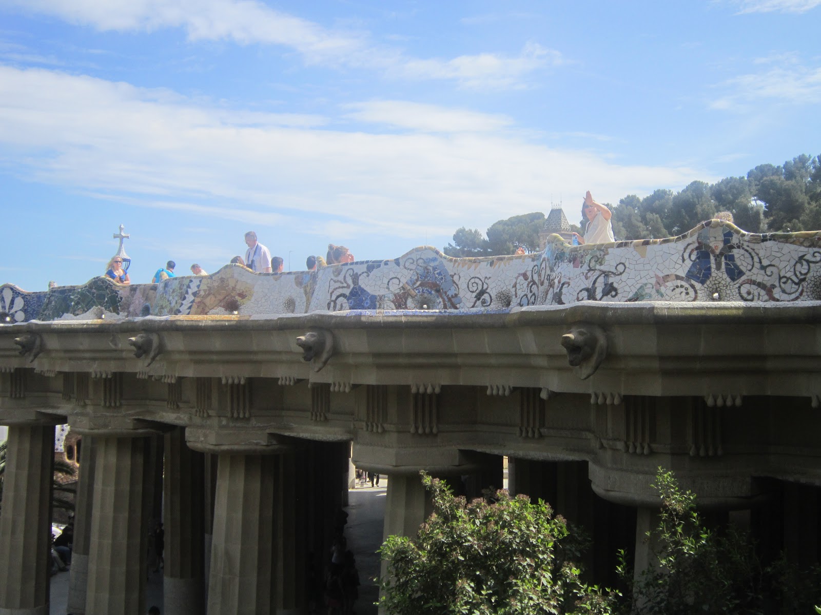
The Casa Museu Gaudi was still very detailed and intricate but not as detailed as the Sagrada Familia, which was Gaudi's last work. The building is very outlandish and modern even for today. The shapes are very fluid and organic. The building is decorated abundantly in colourful mosaics which create intricate patterns.
Barcelona: Sagrada Familia
In Barcelona, I next visited the Sagrada Familia, the famous cathedral designed by Catalan architect Antonio Gaudi. Below are just a few of the photographs I took of outside and inside the cathedral:


I found the visit really inspiring. One thing that I noticed about Gaudi's designs was the intricacy and attention to detail. You can tell that the architect has thought about every single minute detail while designing the structure. On this visit I learned that Gaudi took a lot of inspiration from nature.
Barcelona: The Museum of Contemporary Art
Earlier this week I went on a trip to Barcelona. Whilst I was there I visited the Museum of Contemporary art.
At the Museum of Contemporary Art, there was an exhibit where there were were a series of seven rooms, each lit in a different colour (below). Coloured light could be used in a photo shoot. This would give the image a completely different feel. Colour could be used to symbolise a feeling or emotion.


There was also this display on the wall (below) where pieces of furniture has been joined on top of each other in what appeared to be a random fashion. This reminded me of a lot of my "runaway" designs where outfits appeared to be "thrown together".

Francis Bacon
From researching Austrian artist Egon Schiele, I decided I wanted the makeup for the runaway theme to be warped and twisted to symbolise that the subject is a victim and has been manipulated. Another artist that depicts figures as deformed and distorted is Francis Bacon. The figures he paints are a lot more abstract than Egon Schiele. I decided to also look into the British artist for inspiration.
Francis Bacon was active during the 20th century from 1929-92. He mostly painted people although they were so abstracted, a lot of the time they didn't even look human. A lot of his work came after World War 2, when the deaths in the Nazi concentration camps were starting to surface. One of his first paintings, Three Studies for Figures at the Base of a Crucifixion3, depicts mutated forms which are said to symbolise human corruption which relates to my theme. He created a few paintings which were hybrids of humans and fictional monstrous creatures. These could be a symbol of human nature.
His style is definitely expressionistic. He often created a blurred and smudged effect. His paintings look as if he has casually smeared the paint across the canvas. In some of his paintings he smears the faces of subjects, making it look as if the face is disappearing. In some paintings he has completely blocked out some facial features. His brush strokes are very distinct. There are no or few harsh lines or angles in his work; lines and forms are very fluid. However, the brush strokes also appear to be rapid and aggressive. A lot of his paintings have a violent quality to them. A style he became accustomed to using was where he would paint vertical streaks over his subjects which looked like they were caged.
The colours he uses are mainly dull, bloody and fleshy. Death is a theme that features in his work quite frequently. He builds up thin layers of colour to create a ghostly translucent effect. Although a lot of his paintings use very dark, dull colours, a lot of his paintings also employ a wide range of tones. In these paintings his shading and highlighting is very clear cut and exaggerated and not blended out much. There is a high contrast between light and dark.
Research Resources:
http://www.francis-bacon.com/
http://www.all-art.org/art_20th_century/bacon1.html
Francis Bacon was active during the 20th century from 1929-92. He mostly painted people although they were so abstracted, a lot of the time they didn't even look human. A lot of his work came after World War 2, when the deaths in the Nazi concentration camps were starting to surface. One of his first paintings, Three Studies for Figures at the Base of a Crucifixion3, depicts mutated forms which are said to symbolise human corruption which relates to my theme. He created a few paintings which were hybrids of humans and fictional monstrous creatures. These could be a symbol of human nature.
His style is definitely expressionistic. He often created a blurred and smudged effect. His paintings look as if he has casually smeared the paint across the canvas. In some of his paintings he smears the faces of subjects, making it look as if the face is disappearing. In some paintings he has completely blocked out some facial features. His brush strokes are very distinct. There are no or few harsh lines or angles in his work; lines and forms are very fluid. However, the brush strokes also appear to be rapid and aggressive. A lot of his paintings have a violent quality to them. A style he became accustomed to using was where he would paint vertical streaks over his subjects which looked like they were caged.
The colours he uses are mainly dull, bloody and fleshy. Death is a theme that features in his work quite frequently. He builds up thin layers of colour to create a ghostly translucent effect. Although a lot of his paintings use very dark, dull colours, a lot of his paintings also employ a wide range of tones. In these paintings his shading and highlighting is very clear cut and exaggerated and not blended out much. There is a high contrast between light and dark.
 |
| Three Studies for Figures at the Base of a Crucifixion, 1944, oil and pastel on cardboard The figures here are monstrous, deformed and grotesque. |
 |
| Head I, 1948, oil and tempera on wood Bacon merges a human head with a monstrous and grotesque being like the figures from the Figures at the Base of a Crucifixion |
 |
| Untitled (Figure), 1950-1951, oil on canvas After 1950, Bacon began featuring this streaked paint effect which created the look of a cage  The paint is smudged, half concealing the identity of the subject |
 |
| Figure with Meat, 1954, oil on canvas The dark, fleshy colours look violent and threatening |
 |
| Three Studies for a Crucifixion, 1962, oil with sand on canvas I love this style of his, which became more emphasised in Bacon's work in the early 1960s where his figures are extremely warped with dramatic colour contrast. I think I will try and incorporate this style into my makeup look. |
 |
| Study for Head of George Dyer, 1967, oil on canvas The colours used are unrealistic and I like how the face appears to be melting |
 |
| Study of Isabel Rawsthorne, 1966, oil on canvas This image is extremely grotesque and the dark colours make it look even more sinister and haunting. The face has been manipulated so much it doesn't even look human anymore. |
 |
| Study of Henrietta Moraes, 1969, oil on canvas The face looks broken up like a jigsaw puzzle. The contrast between shadows and highlights is very extreme here. He appears to use a swirling motion with the brush. |
Research Resources:
http://www.francis-bacon.com/
http://www.all-art.org/art_20th_century/bacon1.html
Subscribe to:
Comments (Atom)